Wednesday, 31 March 2010
Evaluation: Question 1
Below are 9 key shots which I have annotated to show the links between our music video and existing videos to show how we have used and developed the media conventions.
In case these embedded Scribds do not work the links are above each.
Question 1
I used Georgina's answer to question 1 to help me gain a greater understnading of what I had ot do and as we worked in the same group we researched the same videos and liked the same shots in our own video and so the shots commented upon are quite similar.
Question 1: Digipak and Website
Tuesday, 30 March 2010
Evaluation: Question 2
In case these embedded Scribds do not the links are above both.
Question 2
I used Georgina's answer to question 2 so that I could gain a greater understands of what I was expected to do.
Question 2 Improvements
Monday, 29 March 2010
Evaluation: Question 4
Sunday, 28 March 2010
Evaluation: Question 3
Ones we had finished our second rough cut we decided to get some of the class to view it and give their opinions as we knew they had a media focused mind and an understanding of how music videos should look. The main piece of feedback which kept being mentioned was the fact that the editing of the clips in the first verse was quit slow and therefore quite boring especially after the fast paced instrumental section at the beginning of the song. We took this on board and changed the editing to make this first verse more exciting so that it would grab the audience’s attention when they began to watch it.
Once we had finished the editing we all added the video to our Facebook accounts so that we could reach a wide range of people include those inside and outside our target audience of 17 to 30 year old males who are either a “Scene Kid”, “Indie Kid” or “Indie Scenesters”. Facebook allowed us to reach people with a media focused mind and those without which gave us a wide range of technical and non-technical feedback.
 Comments we recieved from media minded people
Bradley James: "The cinematography is fantastic"
Jack Osmen: "The editing is sublime, particularly in the introduction"
Tom Butch Martin: "its well edited l,ighting and composition of shots are good ,has good continuity throughout"
Elle Kitchener: "sososo much better than your rough cut. its more exciting now and gripping. very clever some of the camera work, shows skill."
Comments we recieved from people in our target audince
Tor Webster: "Vid reminds me a bit of Vlad the Impaler, think its cos of the dark story and the camera shots"
Conor Keappock: "I really like the idea and the stop start style shots when the clown make-up is going on. It fits really well with the song title and the style of the song, as it too is very sudden and stop starty."
Bradley James:"Loved all the effects and the story was very cleverly shown."
The overall feedback was mostly positive, people liked the editing and the camera work and thought that the storyline was easy to understand. They liked the different transitions and effects used on the video as it made it interesting the two main effects they liked were the Sin City effect on some of the clips, which allowed us to make some of the objects in the black and white clip red, and the fast forward effect used on the clips at the beginning with the strobe light. Many people said that they thought the video was professional and looked like a real music video as well as thinking the clown was highly scary. Some people liked how the storyline and editing reflected the title of the song and the tempo. People also liked the way the chair scene was filmed and edited as it fit the music perfectly.
We only had 2 comments which were a little less positive. The first is the fact that my reaction to Georgina putting on makeup was funny. I would want to change this so that it looked more professional and fit to the scary and dark storyline. The second was by one person who thought the scenes in London were irrelevant even though someone else commented saying “Really liked the bits filmed in on the bridge in London”.
I printed off copies of our digi pak and I handed them to members of the target audience to annotate. The feedback was mostly positive with people liking the pictures on the back and the simplistic text as well as how the picture on the inside cover is the back ground for the website and therefore creating a link. One person said they like how the flower is covering the girls mouth as it "implies she is being silenced".
The only criticisms were that the alignment of the flower was a little off and so should have been more in the center and that the copyright information was hard to read.
With the website I had members of the target audience view the site and write feedback on a piece of paper.

The feedback again was mostly positive with people liking the infomation about the band and the feature of the video as well as the useful links at the bottom of the page.
The only bad feedback we had was that the text on the poster was hard to see and the picture in the background was a little bit blury.
If i had time to change these faluts I would as I would have of liked to create a really stong brand which appealed to the whole of the target audience.
Saturday, 27 March 2010
Friday, 26 March 2010
Final Website
She also added links to the bands other websites so that the user could add them on Facebook and Myspace and view their own official website.
 I really liked this final website as it looks very professional and like a website a band would actually have. I like the background and the way the buttons and the title stand out from the background. I also like how the buttons change colour and their are links to the bands other official web pages.
Digi Pack Finished Template
Thursday, 25 March 2010
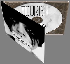
Final Digi Pack 3D
I used Photoshop and a template from the internet to help me create a 3D version of our digi pak, this allowed us to see what the product would look like if we actually made it.
I used the transform tools to make the images fit the case and I also used the Inner Shadow effect on the CD so that it looked like it was actually sitting in the tray.
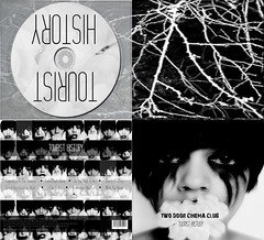
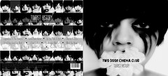
Final Digi Pack
I used Georgina's mock up digi paks and then expanded the idea by putting the name of the album on the front cover and also creating the inside. I though Georgina's mock up digi pak related to the target audience and also it would form a link between the video, the website and the digi pak. Georgina took selection of pictures of herself and so this made it easy for me to create the digi pak as I had all of the elements ready for me to start using.
I used Photoshop to create this digi pak and I used a selection of tools and effects including Drop Shadows, Inner Shadows, the crop and selection tools and the text tool. I also made the CD tray more transparent so that you could see the image behind it by adjusting the opacity of the image.
Tuesday, 23 March 2010
Music Videos in the News
This is a link to an article I found on the Daily Mail website all about the explicit video.
Saturday, 20 March 2010
Digi Pak Analysis
 I have decided to quickly analyse this digi pak front cover as one of the shots we used in the music video was the main girl withe a hand over her mouth silencing her and this front cover has a similar image.
- Simplistic text.
-Artists font so that fans can easily identify with the product.
-Simple but powerful picture as the girl as piercing blue eyes which capture the audience's attention right away.
- The background is simple.
- She has no clothes and so therefore does not detract our attention because her body is then one colour.
- The artsit also does not have much make up on which again makes the audience focus more on her eyes and arm rather than what she is or isn't wearing.
- I like how the title of the album is written on her arm this is very quirky and different.
Developing the Website
Friday, 19 March 2010
Magazine Advert
She did a lot of research into the conventions of magazine adverts and what adverts from the Alteronica genre look like. Georginas Research.

Thursday, 18 March 2010
Responsabilities

Re-Shooting
- Extreme closeups of Georgina applying regular makeup.
- Extreme closeups of Georgina applying clown makeup
- Closeup of Georgina’s face with and without clown makeup
- A medium and a long shot of Georgina turning to look at me with clown makeup on
- A point of view shot of Georgina from my position.
- An establishing shot of me and Georgina in the bathroom together
Hopefully once we have completed the bathroom scene we will have time to go to the woods location and shoot:
- A point of view shot from the bushes of Georgina walking past
- A shot of the clown in the bushes
- A long shot of Georgian walking through the woods and turning to see the clown (but the clown will be out of shot)
Second Website Idea
We all thought that it would be a good idea if the to links change colour when the user cursor was on top of it indicating that there was a link. Kelsey did this creating rollover images which when the cursor was on top of the image the text would be white and the rest of the time the text would be black.


Her is the second attempt at the website through further research Kelsey has realised that that this site needs more development so that it looks like something which would be present in the music industry. She suggested that she may change the background to a picture instead of a bold colour this will also make the buttons more pronounced.

Wednesday, 17 March 2010
Font Choices


 These are the two font that stood out to us the most and we have decided to make the top font for the larger text on both the website and the digi pak and the font at the bottom for the smaller text as it is easier to read large amounts of text in.
Mood Boards
 These mood boards show the locations we want to film at and inspiration we have got from other music videos and films to help us to develop our story line further. There is a reoccurring theme of clowns throughout both mood boards as this is how we want one of the main characters to be dressed as a clown is a major part in out final idea.
Georgina's Digi Pak Mock Ups
DIgi Pak Images

Saturday, 13 March 2010
Response to Rough Cut
There is a section of the video which we have not yet filled and so we cut some of the music out and this is why there is a jump in the soundtrack.
Rough Cut from georgina campbell on Vimeo.
The overall response to our rough cut from Mrs McLuckie was that it had potential but the loose ends needed to be tided up to gain the best marks. The first thing she commented on was the first verse, she thought it was quite slow and boring as it was just Georgina walking forward. She also said the editing was too slow on this section which also made the beginning boring when it is supposed to capture the audience’s attention because it is the fist thing they see. As the tempo of the music and the editing became faster she said the video started to capture her attention although the bathroom scene shots had to be redone as some of them were out of focus. At the end of the video there is a shot where the clown mask rises up from the floor but Mrs McLuckie did not like this as she thought it would take the impact away from the final shot where the mask is dropped. The last comment she made was on the scene at the end of the video were Georgina was struggling with the mask and the clips were fast forwarded to give more of an impact. She liked this but thought the scene went on for to long and so should be broken up slightly.
We showed the roughcut to a few class mates to gain feedback from the target audience and people with a technical mind. The main feedback from the group was that the video had a good storyline and their were some good ideas in the video but they could be executed a little better by changing some of the editing and shots. A few people thought that the photographs and clown faces at the beginning was a bit boring and irrelevant. Another criticism was of the bathroom scene some people felt that this did not make sense but could be good if a few of the shots were changed to include a few more wide shots and point of view shots.
We will use the constructive criticism to develop our music video further.
Thursday, 11 March 2010
Two Door Cinema Club Website

I will show my findings to the group and try to use some of these conventions and features on our own Two Door Cinema Club website.
Two Door Cinema Club's website
Wednesday, 10 March 2010
First Attemps of the back of the Digi Pak
 With this second attempt at the digi pak I added all of the bands singles the same ones as they have on their own albumn. I chose to lay the tracks out in a paragraph rather than a list as it took up less room and from teh research I have doen many Indie bands show their tracks in this way. I made every other single red so that you could easily see the differnet tracks.
Two Door Cinema Club Website
Monday, 8 March 2010
First Website Idea
Kelsey is going to change the layout and colours so that it relates to our video a bit more and the bands genre of music.

Thursday, 4 March 2010
Editing
Georgina took on the role as editor as she picked up the skills really quickly and had a good ear for the counts in the music. Also we agreed that it would become very confusing if we kept switching tasks.
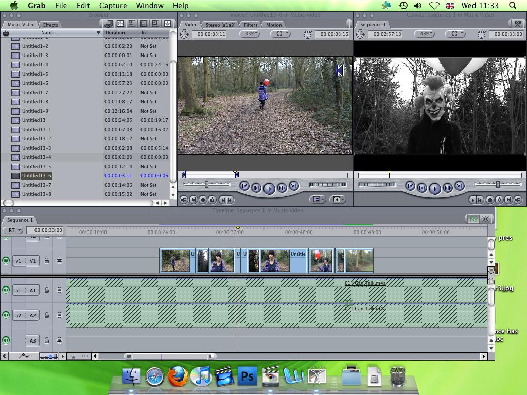
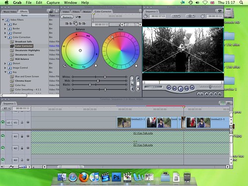
Below are screen shots of Georgina editing.
Here she is editing the first verse - the scene in the woods.
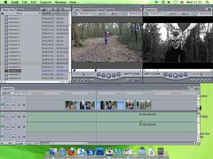
Here she is desaturating the clip to give a more clip that grey scale look that we wanted our video to be in.

Here is a link to Georgina's blog so you can see more clearly exactly what she did.
Tuesday, 2 March 2010
Understanding of Censorship
Censorship
-Wikipedia
1980s
The first ever video to be banned by MTV was Queen’s !982 hit “Body Language” due to the homoerotic undertones, lack of clothing and the amount of sweat. This was belived to be unsitable for the television audience at the time.
Duran Duran’s hit “Girls on Film” was banned by the BBC as it was to sexual as there were several sexual fetishes shown in the video including .topless women wrestling in mud.
1990s
In 1991 the dance sequence of Michael Jacksons “Black or White” video was cut as it showed Jackson touching himself inappropriately. Michael Jacksons most controversial video was “They Don’t Care About Us” as it was banned from MTV, Vh1 and BBC because of the alleged anti-semitic message in the song.
Also in 1991 the country music artist Garth Brooks had his video “The Thunder Roll” was banned from The Nashville Network and Country Music Television for his portrayal of an abusive husband.
Madonna is the artist most associated with music censorship for her highly sexual videos such as “Lucky Star” and “Like a Virgin” as well as homosexuality and references to cross dressing and group sex in “Justify My Love”. The debate over the banning of her “Justify My Love” video resulted in the Canadian music video network MuchMusic launching a program called “Too Much 4 Much”. This program would show banned music videos late at night with a discussion show after where the members would talk about why they though the video was banned.
The Prodigy had their hit “Smack My Bitch Up” banned in several countries due to the depiction of drugs, sexual content and nudity. They also had their single “Firestarter” banned by the BBC because of its obvious references to arson.
2000s
In 2000 Robbie Williams’s video for his hit “Rock DJ” caused controversy as it showed Williams naked and peeling off his own skin revealing flesh. This was banned in the Dominican Republic and censored in the UK.
In 2002 Russian duo t.A.T.u caused controversy with their single “All The Things She Said” as it showed the 2 girls embracing and eventually kissing. Richard and Judy the television presenters began a campaign to have the video banned as they thought it would be highly appealing to pedophiles with the use of school uniforms and young girls kissing. The kiss was also choreographed into the girls live performance and when t.A.T.u appeared on Top of the Pops the kiss was replaced by audience footage so that it was not shown on television.
Monday, 1 March 2010
Breaking the Colour Barrier
Before 1983 Michael Jackson also struggled to get shown on the channel. To break this colour barrier the president of CBS Records, at the time Walter Yetnikoff, spoke out against MTV and threatened to take away MTV’s rights to play any record from the CBS label. After this Michael Jacksons “Billie Jean” began to play regularly on the channel amongst other black artists.
MTV Channels
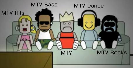
The 5 Main MTV channels have their own individual characters which relate to the genre of music played on the channel.
MTV Hits shows chart hits and very few MTV shows. The channels character is a girl who looks very mainstream and up with times remembering the current and up to date music hits.
MTV Base focuses mostly on R'n'B, Hip-Hop, Reggae, Soul and Urban music and this is why the character is black, with a piercing and baggy clothing as this is the stereo type of R'n'B, Hip-Hop, Reggae, Soul and Urban artists.
MTV is a general music and entertainment channel and as this was the first of the channels the character used to symbolise this is wearing a crown so that it shows that this was the first channel and is the “king”.
MTV Dance is a 24 hour dance music channel and this is why the channels cartoon character is wearing head phones and is in dance clothing.
MTV Rocks (formaley known as MTV Two) is focused on alternative and rock music and this is why the channel character looks like a stereotypical “Rocker” with long hair and black clothing.
 VH1 tries to target a more mature sophisticated audience of people between 25 and 44 year olds.
 VH1 Classics (now rebranded as MTV Classics) shows music videos and concert footage from the 60’s up to the 90’s and sometimes feature footage from eras as early as the 40’s.
Mtv Also own the following channels:
• MTV +1
• MTV HD
• Comedy Central
• Comedy Central +1
• Comedy Central Extra
• Comedy Central Extra +1
• Nickelodeon
• Nick Replay
• Nick Jr.
• Nick Jr. 2
• Nicktoons
• Nicktoons Replay
The Launch of MTV
In the beginning the channel was solely used to play music on 24/7 but now a days you can see live award shows and view reality television programs such as “My Super Sweet Sixteen” and “The Hills”. New reality shows like these have created a new brand of celebrities whereby they are famous for doing nothing apart from being on this show. The format of these kinds of shows are supposed to show the raw reality of the characters lives, the cameras follow the characters around all day for a couple of months so that they can get a good amount of footage to put in the series.
Sunday, 28 February 2010
Music Video History
Music videos use a wide range of styles of film making techniques, including animation, live action filming, documentaries, and non-narrative approaches such as abstract film. Some music videos blend different styles, such as animation and live action."
- Wikipedia
When sound films and talkies first came about there were a lot of short musical films, one of the biggest film series were the Spooney Melodies, produced by Warner Brothers. The film would usually last about 6 minutes and would feature art deco animation and backgrounds as well as the performance of the band, singers and dancers. These short films can be argued as the first music videos.
Musical films, from the 1930’s to the 1950’s, have been very important in influencing modern music videos. One of the best-known examples is Madonna's 1985 video for "Material Girl" which was closely related to "Diamonds Are A Girl's Best Friend" from the film Gentlemen Prefer Blondes. As well as Michael Jackson's “Bad” video, this was influenced by the stylized dance fights from the film “West Side Story.
Tuesday, 16 February 2010
Geri Halliwell - It's Raining Men Analysis
This video is set in many different locations and is focused mainly on the physical body. It has a theme based around the musicals Fame and Flashdance.
Intertextuality- many themes are used including Fame and Flashdance.
The camera shots are nearly all from the front showing Geri Halliwell face on. Many people star in this production and it is very energetic and lively.
At the beginning the first words of the song are “humidity’s rising“and the camera shot moves upwards to match the lyrics. Later during the video when the words “getting low” are sung the camera shot moves downwards.
During the chorus more dancers join in, in a carnival style with lots of colour and dynamic dancing. But up until them the colours in the video have been mainly black and white.
During the first scenes the dancer is not identified. This video is based around the empowerment of women and launched Geri Halliwell as a solo singer. She used this opportunity to present herself in a new way and to show off her new slender and lean body.
There is a contrast between the judges being dressed in suits and the dancers dressed in leotards and leg warmers. The judges are dressed very formally in business suits and are looking at her over their glasses and frowning showing that they are not impressed. Half way through the video Geri kisses the head judge trying to break down any barriers that there may be between them.
The video is mainly a song and dance routine with excerpts from both Fame and Flashdance included in the sequences.
The record scene relates to Flashdance and enables her to mess up as the needle on the record slips. There are also shots showing other students ridiculing her from the doorway.
Diegetic noise of the dancers’ footsteps can be heard as well as traffic and the needle going around the record on the record player
The sequences of fragmented body shots create a feeling of anticipation.
The fact that a record is being played on a record player shows that this is set in pre CD era.
First close up
Formal made of address
As music starts she is looking at her feet or the judges.
The shot at foot level showing the judges tapping their feet is reoccurring all through the video and there is lots of movement of the cameras with her. There are also over the shoulder shots which show us the judges’ perspective.
There are many quick cuts to show the vigorous pace of the video.
The second half of the video is much more colourful and shows her in many different outfits, it also shows her doing lots of different physical activities including running down the corridor to rehearsals (links to American school), aerobics, curl ups ,kickboxing and even ballet. This is to depict that men can not be relied upon and women lead the way.
The last section of the video is set outside in a New York street with lots of colour including a yellow taxi showing an extremely up -beat mood and full of life, although the weather is raining. She is wearing a top with “famous” on it which looks like the Fame logo.
Monday, 15 February 2010
Website analysis of differnt genres

Digi Pak analysis
 This image is from www.distorture.co.nz/distorture-revere.html
Colours: the colours are the same throughout the digi pack the contast of white and red is then again reflected in the red paint/blood on the persons pale hand. These colours work well together because they contrast and are both very bright.
Pictures: there are only 2 pictures on this digipak and these are both the same this makes the digipack look simplistic and
Text: there is not alot of text which makes the digi pack simplistic and easy to look at.
The use of logos: on this particular digi pak the logo is shown on the front cover and on the CD which brands the product and allows the audience to become familiar and identify with brand.
Website analysis
 One of the website I knew I wanted to analyse was Florence and the Machine's as I believe that she has a very similar sound to Two Door Cinema Club.
From looking at the website I can see that it is very quirky and strange which is also how Florence herself and her music is portrayed. All of the links are on a giant pair of lungs which relates to the artist album. The links are in white and so stand out from the deep red background of the lungs.
On this homepage she has the video of her latest single just like many other band websites do and so this is a feature we will want to add to our website.
At the top of the page is a picture of the artist this allows the fans to become familiar with the artist and identify her.
The main piece of information down the middle is news and her blog. By having this feature it allows the user to feel closer to the artist.
The colours used are quite dark and dull because they are the colours of wood, stained paper and lungs but some how these colours contrasted with the brightness of the text works and is easy for the user to read.
Another thing which has been used on this website is the use of the bands official font for the title of their name at the top of the page we will have to insure we do this so that the audience can become familiar with our brand and learn to identify with the band and their products.
Editing
Saturday, 13 February 2010
Bullet for my Valentine - Tears Don't Fall analysis
-Mainly performance with a bit of narrative - band playing instruments
-Close ups mostly - mostly of the lead singer
-Bluey/Grey lighting making the video pale and Gothic
-Editing gets faster on the instrumental
-Moving shots - the camera is hardly ever static
-The rain makes is more powerful and emotive
Girls Aloud - Biology Analysis
-The band actually performs through dance and singing
-There is no instrumental band
-There is no narrative
-Very stylised with 5 different costume changes
-Wide shots to include the whole band and closes ups to focus on the person singing solo
-The camera is quite static just panning when the scene changes
-Lots of cross dissolves which are common in pop videos
-Bright colours and lighting are used to create a happy up beat feeling in the audience
Wednesday, 10 February 2010
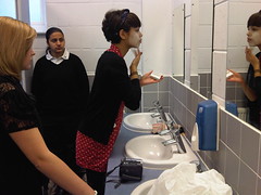
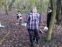
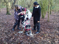
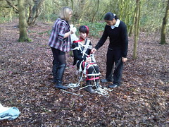
Filming

Animatic
Animatic - Editing
Tuesday, 9 February 2010
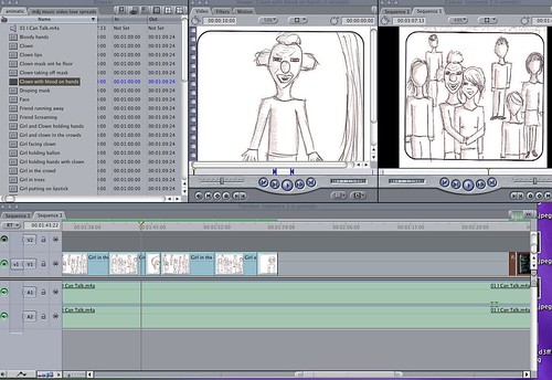
Storyboard
Friday, 5 February 2010
Characters
There will also be 3 other clowns that appear in the video these will be played by myself, Rakhee and our friend Freddie.
I will also play the main girls friend in the bathroom scene.
